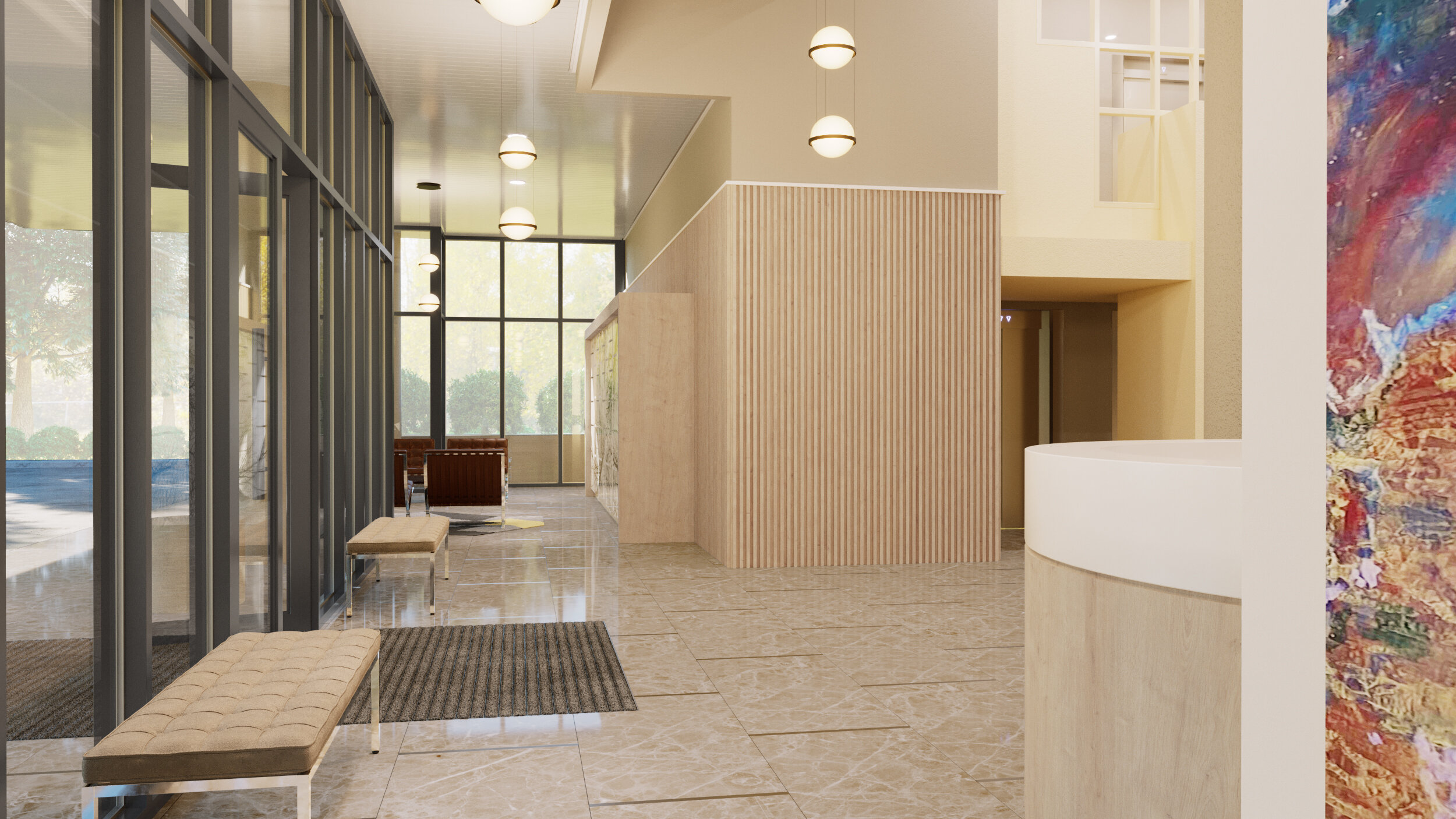
Scheme 1 for Condominium Entry Lobby renovation are the first 4 images and Scheme 2 for the following 4 images.
Scheme 1 for the Lobby has a classic modernist approach. The monolithic terrazzo floor flows from the Porte Cochere into the interior. The front doors will be addressed with new door handles, and inset floor mats. The new reception desk is placed forward into the lobby, providing more visibility to the staff and residents. The millwork for the reception desk features a monolithic white quartz counter, with a generous nosing and flowing to a lowered counter area. The reception area will have a designated storage grid for resident packages, collected by building staff. The vertical wood wall panels accent the reception and the far wall, providing a warm tone with the vertical white oak panels. The lobby column has a custom terrazzo bench, with fluted terrazzo panels. The rear walls between the elevator bank and the rear exit door, are clad in large format statuary marble panels, accented with wall mounted light fixtures. The mailboxes are relocated to the west foyer, clad in a wood entablature elevated above the floor on steel columns, and faced with a 3-dimensional tile. The new mailbox millwork will provide a brighter daily experience for the residents, adjacent seating is available to review the day’s mail. The wall behind the mailboxes will be faced with the marble wall panels to provide a durable material for the high traffic area, and the built-in trash receptacle considers the daily rituals. Adjacent to the elevator banks, the wall niches will have mirrors to provide guests with last-minute touch-ups. The Lobby lighting is accented with a series of floating globes.
Scheme 2 for the Lobby has a formal warmth. The floor from the motor court to the interior, has a large format travertine patterned tile, with a metal accent between tiles. In this scheme, the front doors are addressed with a new handle and inset floor mats. The Lobby entry is dominated by a pair of illuminated architectural metal screens, with patterns inspired by the Atlanta street grids. The reception desk has a prominent sweeping curve into the lobby space, with an adjacent wood panel that engages the east foyer to display the painting that was previously in the west foyer space. The West foyer has a bank of automated mailboxes for packages, covered in a large format graphic of the silhouetted Ansley trees and adjacent seating area. The residential mailboxes will stay in place, illuminated with new lighting.
Architects Note: Scheme 1 is my favorite. There is an option to take a combination of design elements. Scheme 2’s Architectural Metal screen could replace the marble panels from Scheme 1, for the dominant Lobby wall- for example. The distinct difference between the schemes is the Automated package box system, within scheme 2. This system would remove the staff’s involvement in package handling, other than oversized deliveries. Conversely, Scheme 1 provides better storage of the resident’s temporary package collection, but the staff will continue to manage the intake and distribution. In Scheme 1, the daily ritual of the mail collection for residents is an improved experience moved to the west foyer with the bright light and cheerful seating.


